I Recreated A Segment of The School Of Life Video Using Figma.



About The Tool. & a little bit about me.
For those who don’t know what Figma is — it’s a vector graphics editor and prototyping tool. It’s predominantly used by UX/UI designers to communicate their app or web projects in a more realistic manner.
I work as a content writer at an agency that specializes in UX/UI design and Figma is amongst the most used tools by my designer colleagues. Naturally, it’s the tool i gravitated to first, initially for illustrative purposes to accompany the insights and case studies that I write.
Overtime, I found out about the Prototyping feature and began incorporating that into my illustrations to give them a bit more life. Ever since then, I’ve been challenging myself to make the most out of Figma by transforming my written content into an explainer video type of format.
The Inspiration.
I thought it would be a good exercise for me to recreate other animated videos using Figma and decided on this video from The School of Life.
I’m absolutely blown away by the visuals in this video. I think both the illustrator and the animators are extremely talented and I wanted to try and recreate their work. The process forces me to deconstruct the various layers and I’ve picked up a few tricks as a result.
My Process.
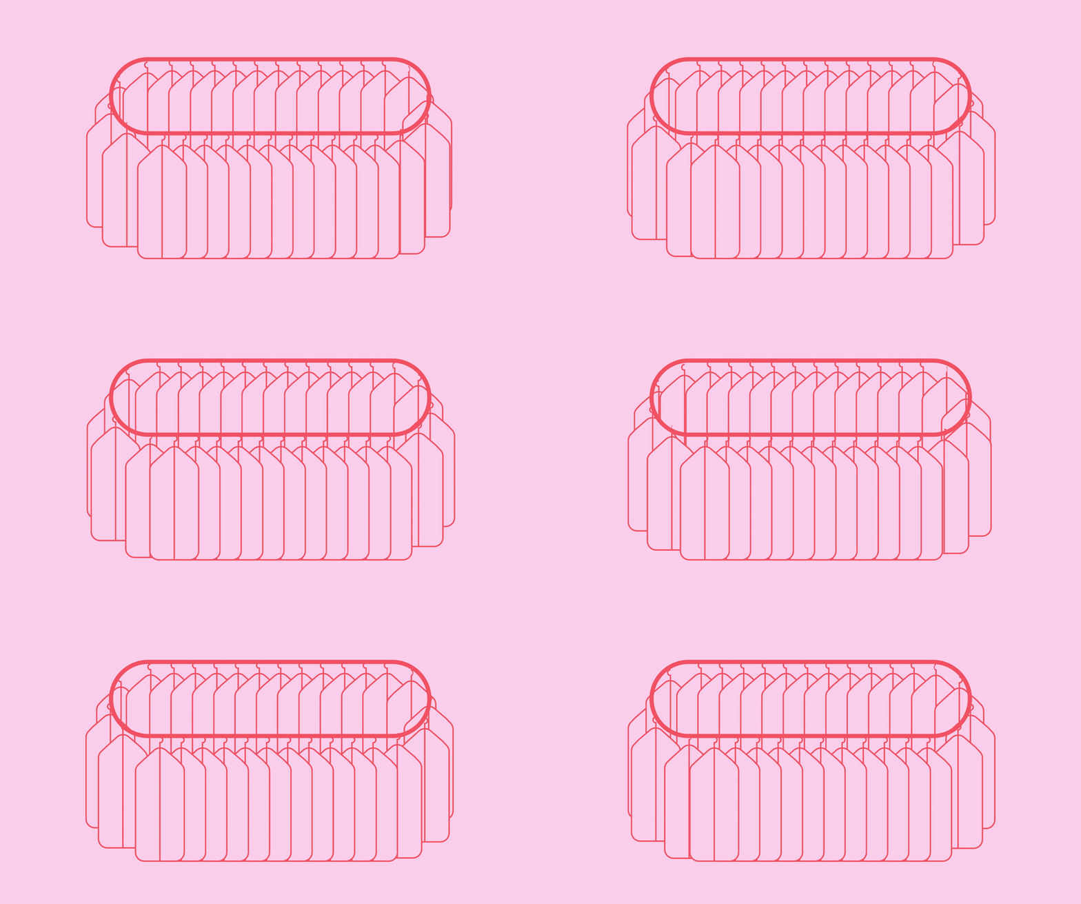
The 1st Scene — Rotating Clothing Rack.

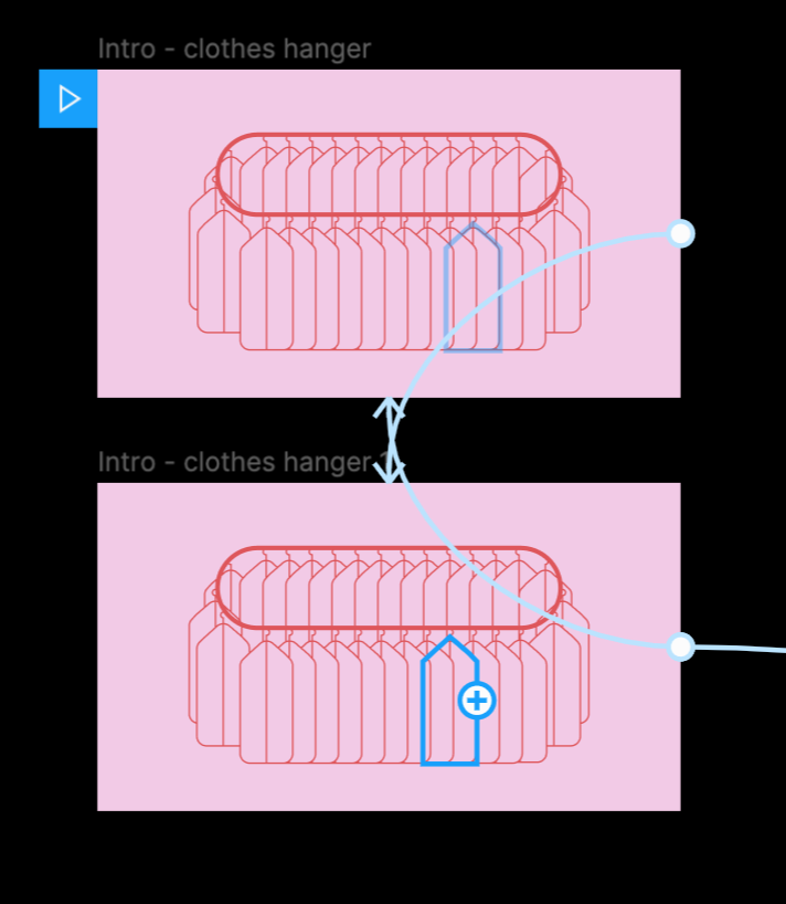
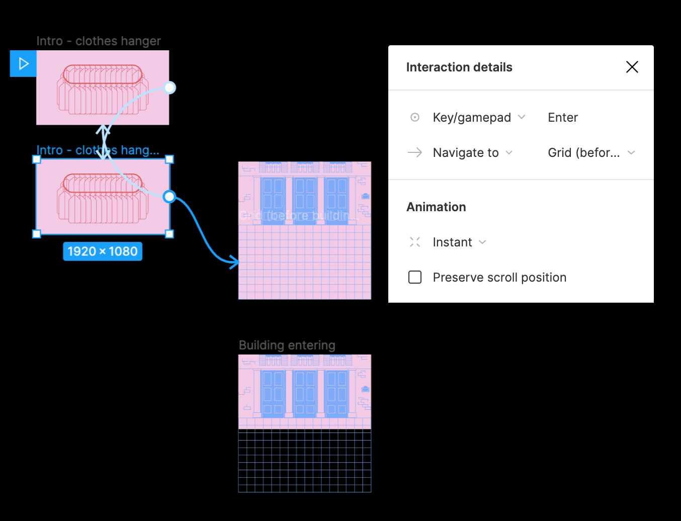
Initially, when I looked at the frame in the original video, I thought it would require an endless amount of frames. I spent a lot of time by trial and error to figure it out; it’s not perfect but I managed to make it work in 2 frames. I did it by moving each clothes hanger in the 2nd frame by one position to the left from the 1st frame (and let smart animate do the rest).
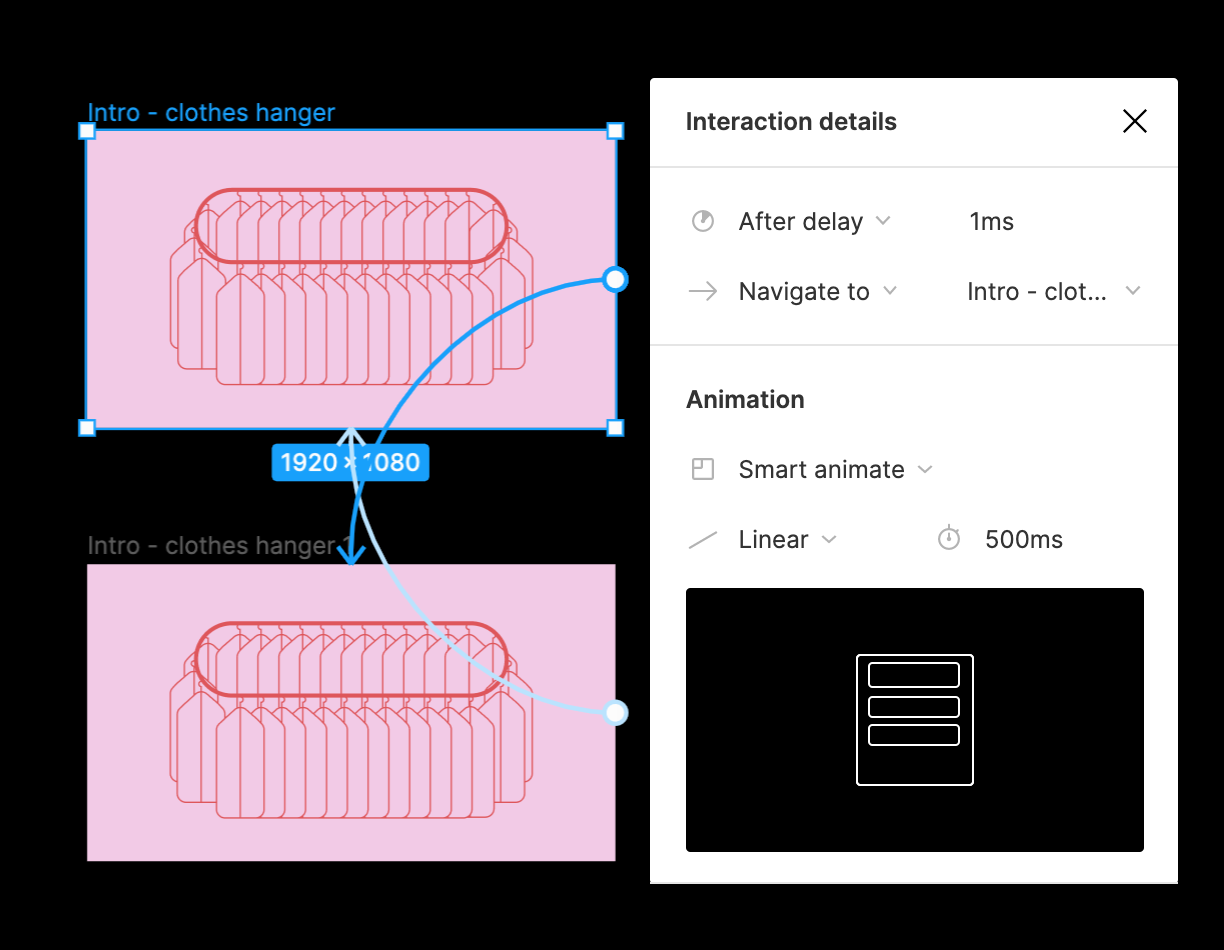
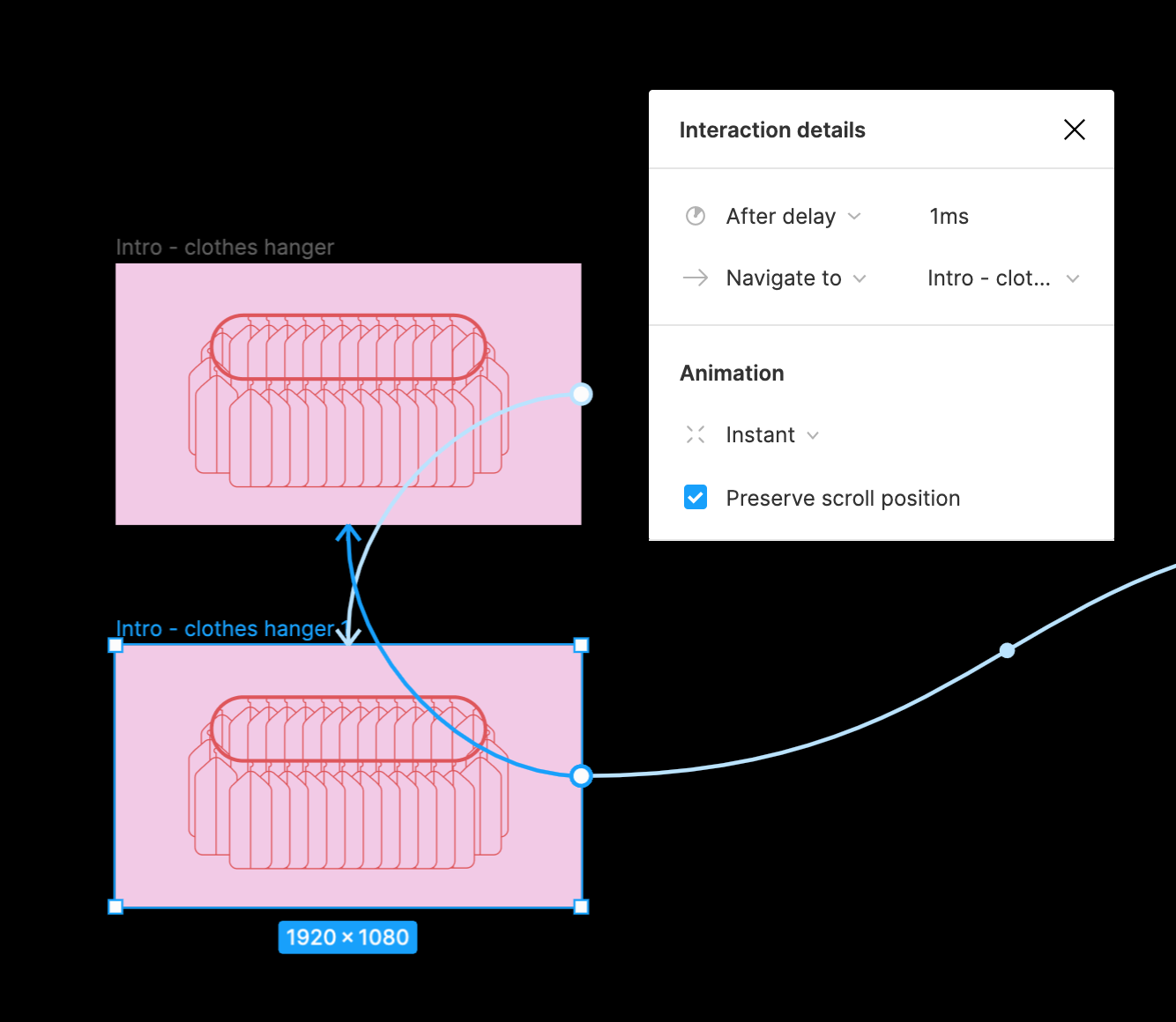
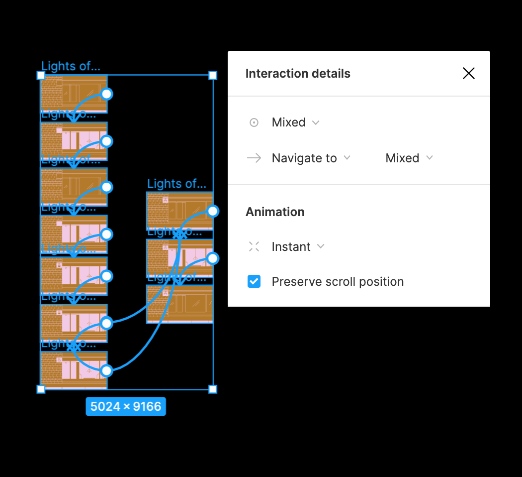
For the interaction details, I used ‘smart animate’ to transition from the 1st to the 2nd frame and ‘instant’ to transition the 2nd frame back to the first — thereby creating a loop.
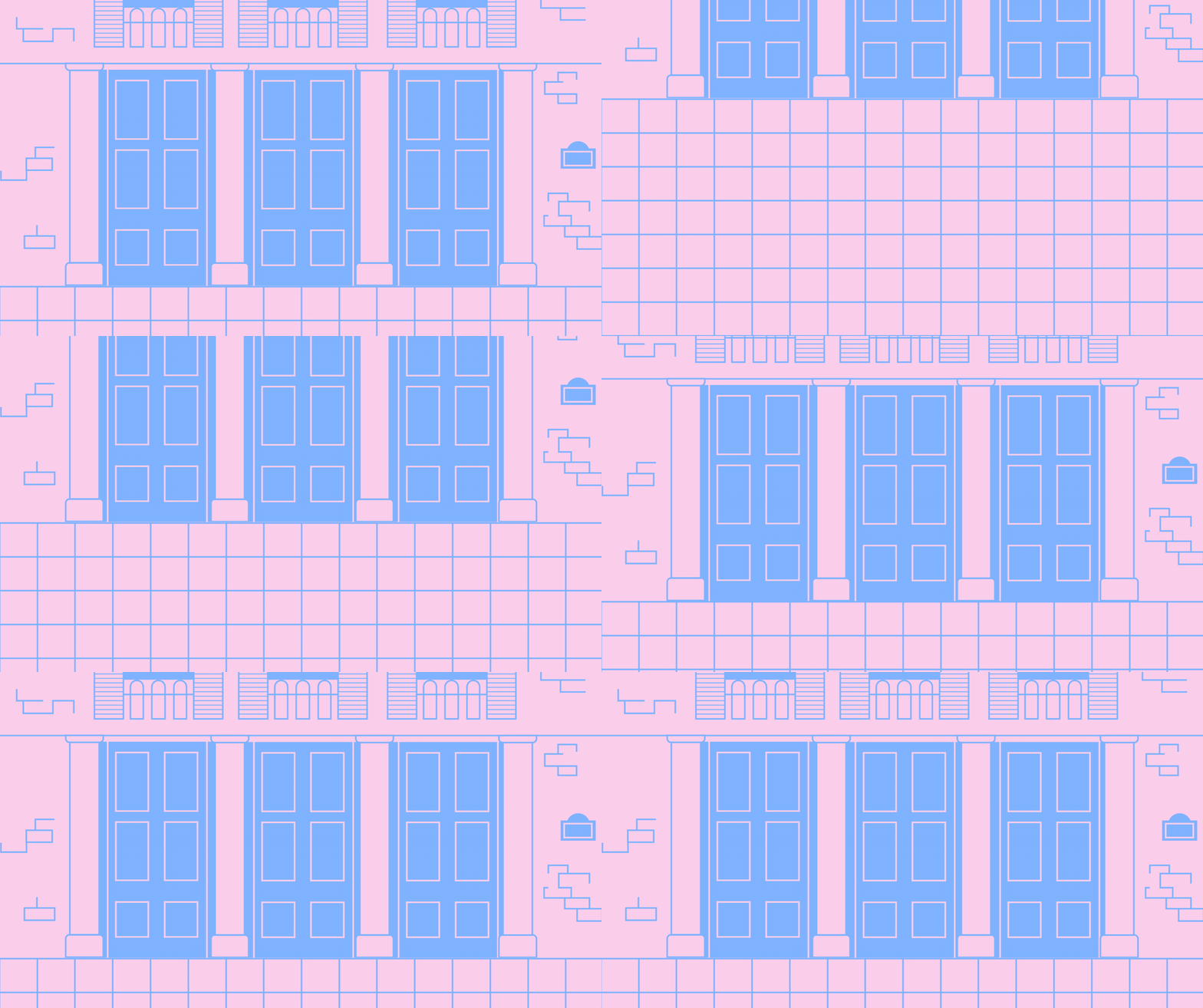
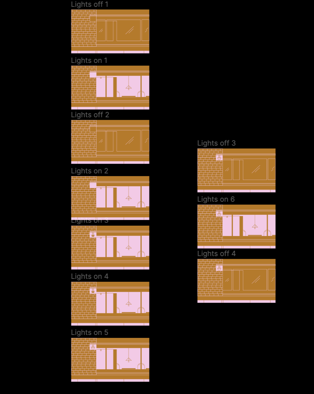
The 2nd Scene — A Building Sliding Into View.

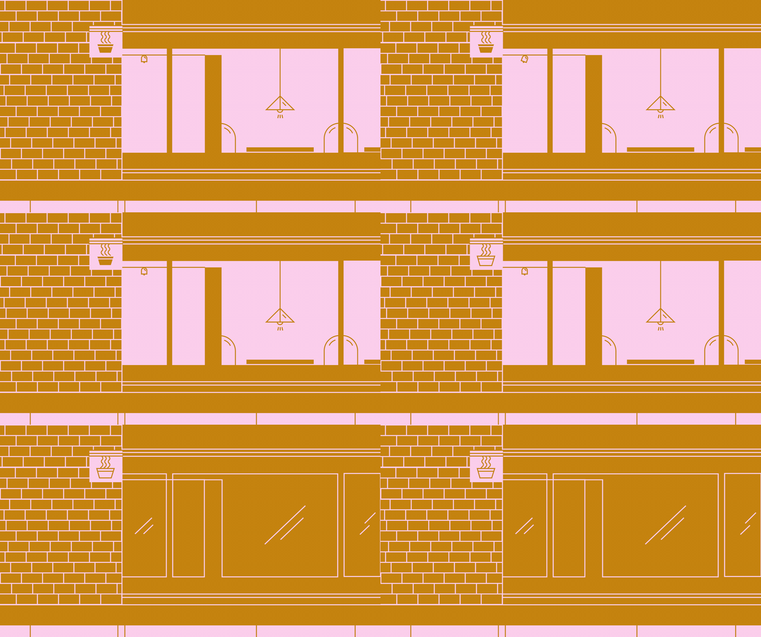
Now that I’m writing this, I realized I could have done this using only one frame on Figma because the only interaction is the artboard sliding down to reveal the building; I would just need to extend the length of the tiles. However, I didn’t know that at the time and did it in two frames — the first to showcase the tile and the second to showcase the building.
I used ‘Smart Animate’ to transition from the first frame to the second frame.
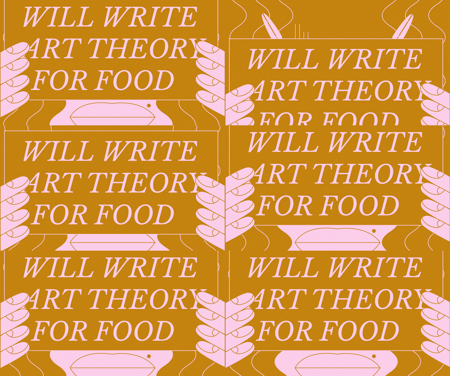
The 3rd Scene — Will Write Art Theory For Food.

This could also have been done in one frame had it not been for the animated hair. But essentially, it follows a similar trajectory to the previous frame. The second frame sees the hand and the sign moving upwards, after the first frame. The last three frame is to show more hair movement while everything else remains static.
I used ‘smart animate’ for a seamless transition for both the sign moving up and for the flowing of the hair.

The 4th Scene — Slot Machine.

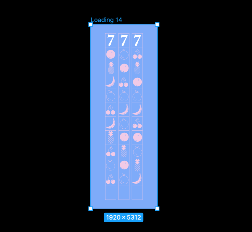
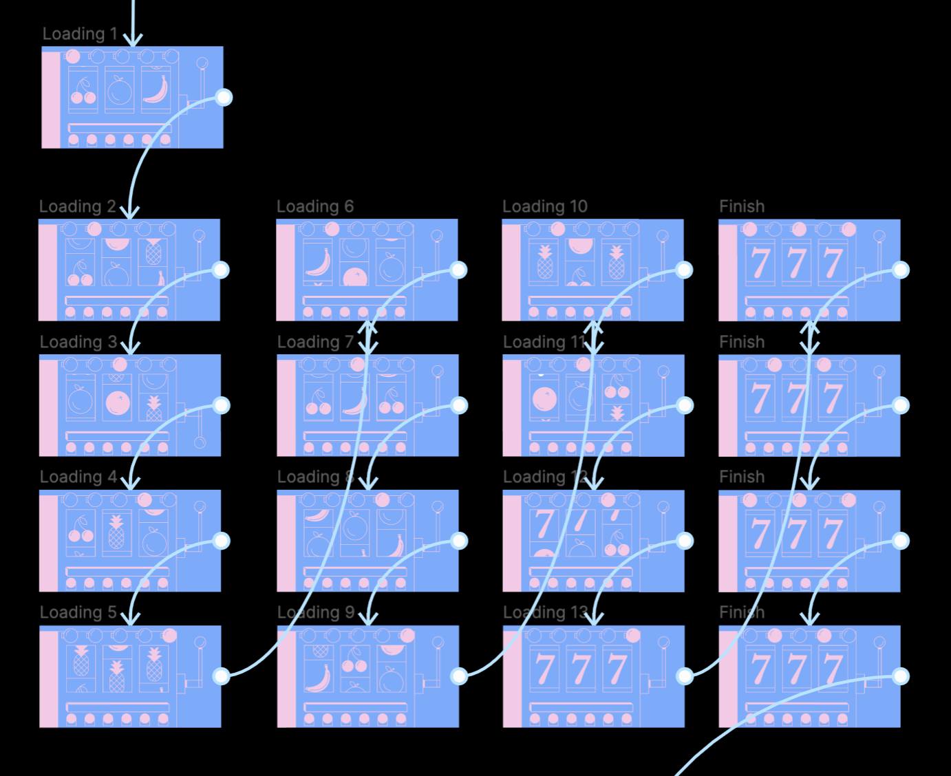
This one was very time consuming. I started by creating a mask of the three columns of fruits and slide it downwards with each passing frame. Alongside the spinning slot, there’s also the light signal and the lever movement.
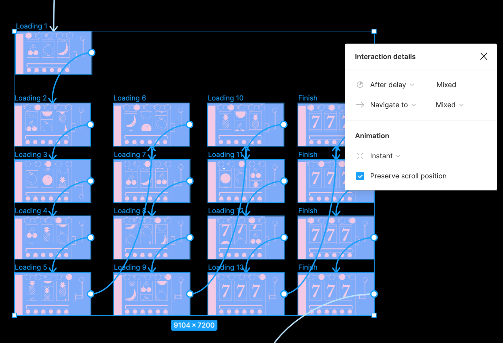
All the interaction for this scene is set to ‘instant’.
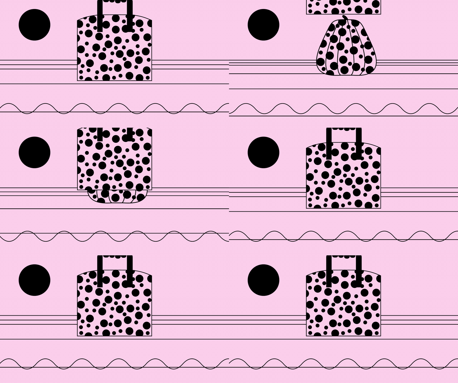
The 5th Scene — Polkadot Pumpkin & Bag.

This scene is quite simple compared to the others. Using 2 frames, and ‘smart animate’ in between, I was able to show the waves movement and the bag sliding in front of the pumpkin.

The 6th Scene — A Noodle Cafe

Because the transition for this scene is quite rapid, similar to the Slot Machine scene, all the interactions were set to instant.
The 7th Scene — A Woman & Her Donut.

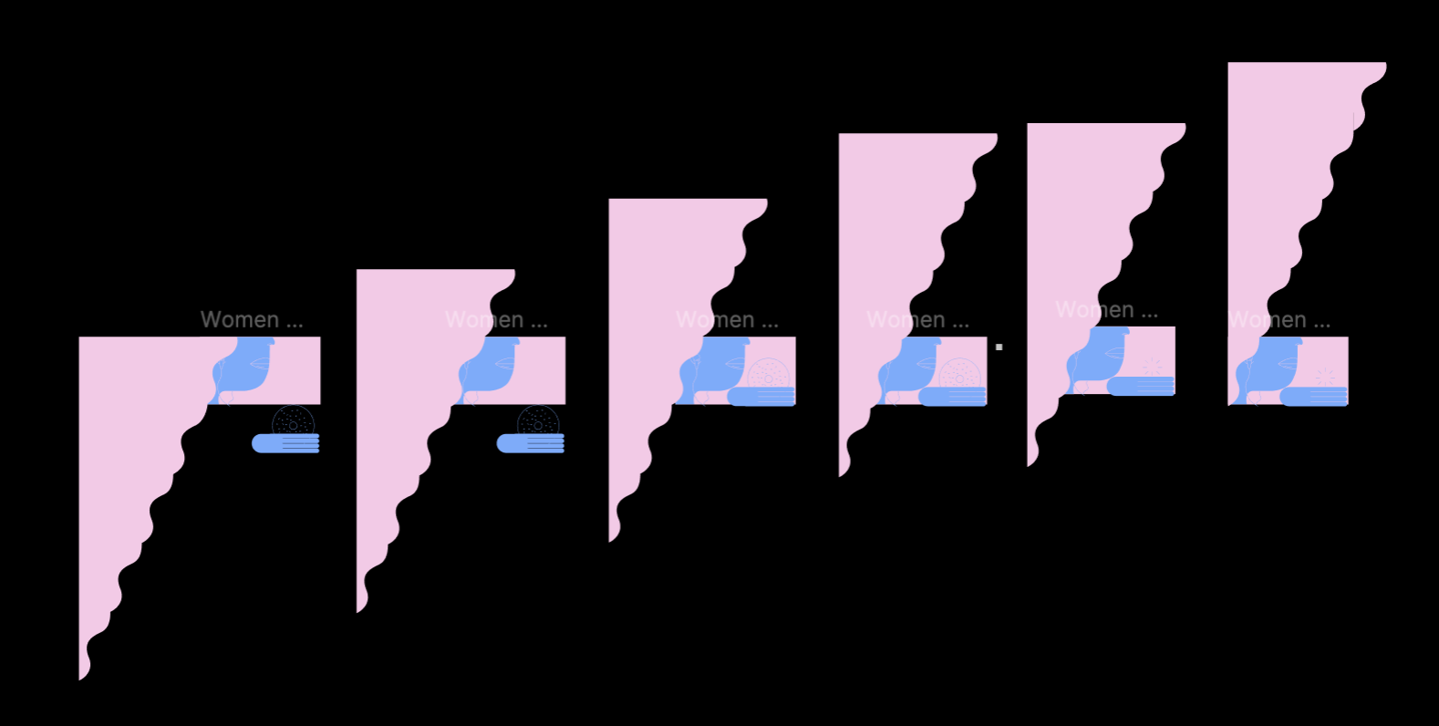
The last scene works in the same principle as the second scene. There is the hair flowing movement throughout with the hand and donut moving up and eventually ends with the donut popping, achieved rather seamlessly with ‘smart animate’.
Some Tips.
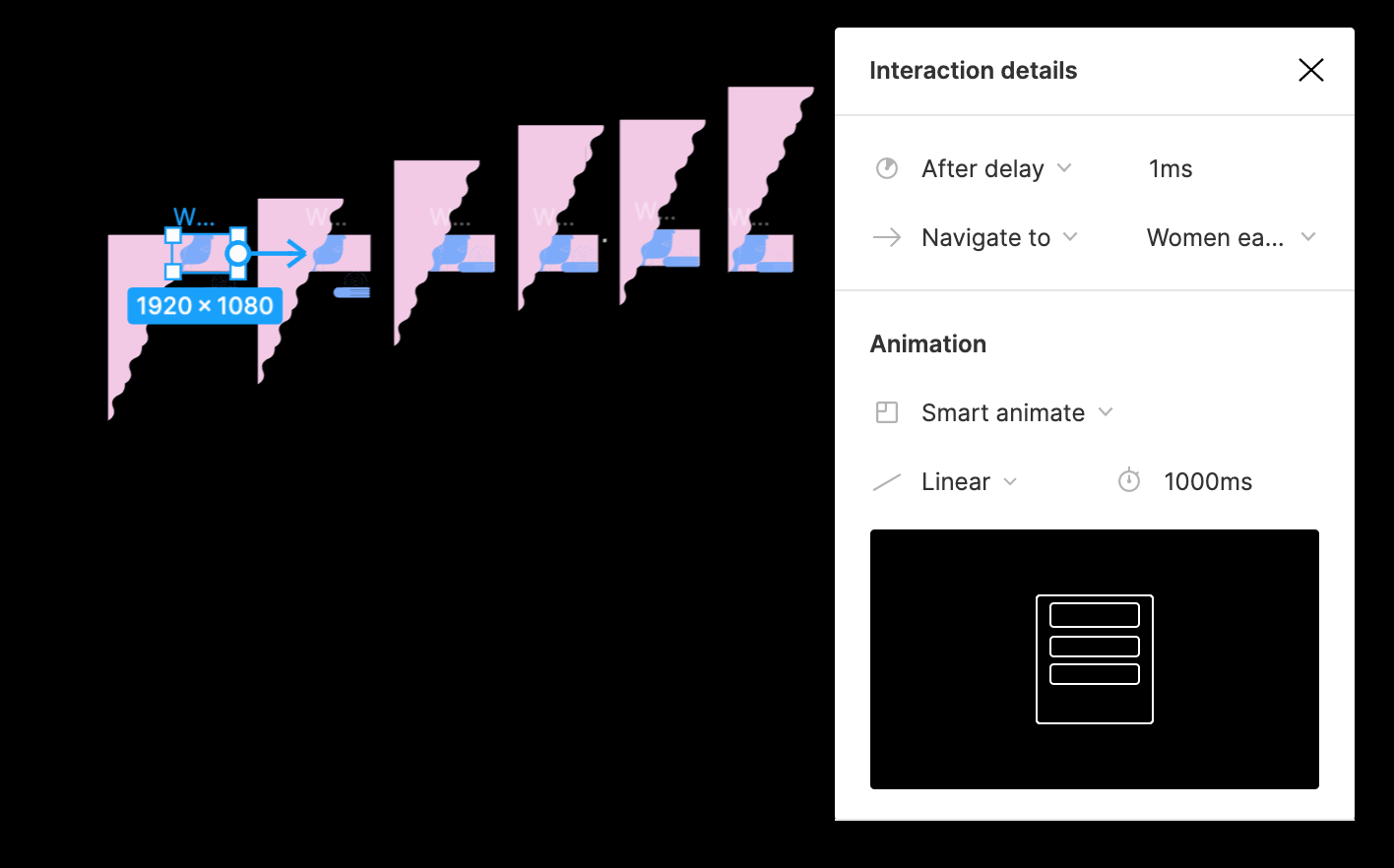
The three essential components to look out for in the Interaction details, is the interaction type, animation, and timer.
- Interaction Type: After delay, on click, on drag, mouse hovering, mouse enter, etc.
I like to set the Interaction Type to ‘after delay’, which means that after a specified length of time from 1ms (instant) to 100ms, the frame will transition automatically. This is useful for the types of content I do i.e. video explainers where I would like to have all the frames play out automatically as a I record. However, ‘after delay’ can only be used once for each board. Therefore, when I find myself needing multiple actions on the same board, I utilize other interaction types such as ‘pressing keypad’.
- Animation: Instant, Dissolve, Smart Animate (and various transitions within).
I like to use Instant and Smart Animate. Instant is self-explanatory, it is a frame-by-frame animation while ‘smart animate’ animates the changes between matching layers. For example when you move an object from left to right, it can animate that movement seamlessly. However, if an element has been changed, even though theoretically it’s still a matching layer, smart animate will automatically take on the ‘dissolve’ feature which likely isn’t the transition that you intend to do. This is something to keep in mind.
Last but not least, masking. Masks allow us to show specific areas and hide the rest of an image or object. It’s a way to control the visibility of some specific areas of any layer and can be used to show various transitions.
Final Thoughts.
I have no experience with other animation software or animation before. period. And so, I have nothing to compare this too. But I also find that although Figma is by no means an animation tool and that its animation feature is rather basic, I’m always amazed by what I can achieve with it! It’s a bonus that I never have to switch between different software for illustrations and animations.
Are you surprised that Figma can do this? Please let me know, I’d love to hear from you. And if you know a thing or two about animation, I’d love to know how this compares to other softwares like Adobe After Effects for example!
Thank you so much for reading.

